Alliance Francaise San Francisco

The Alliance Francaise of SF is part of an organization that promotes the French culture all around the world

My role was to take the existing WordPress website and redesign it


Skills applied

UX/UI: User Research, User Flow, User Interface Design

Frontend Development: HTML, CSS, WordPress, JavaScript, JQuery
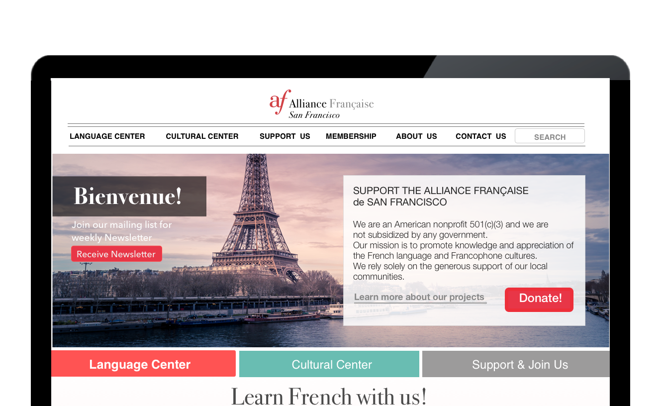
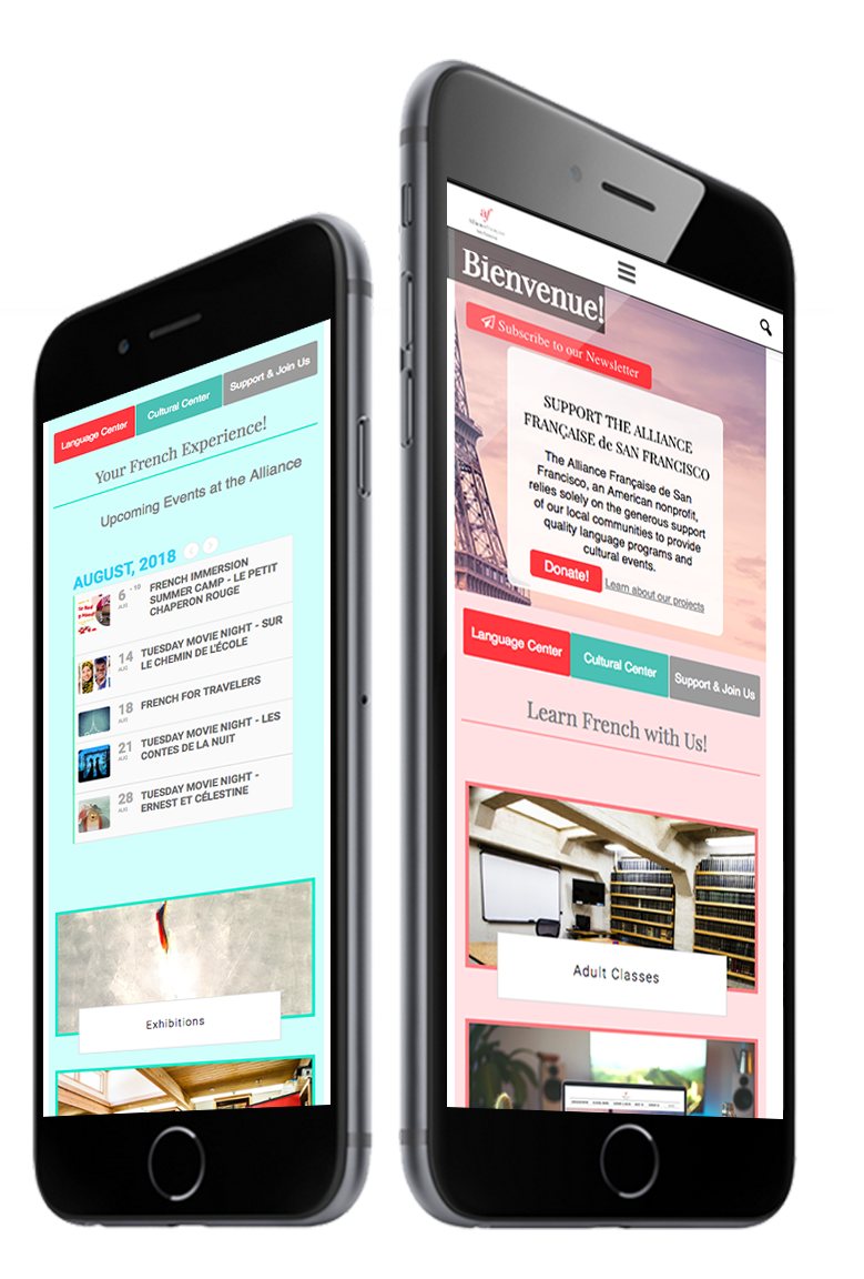
Alliance Francaise fs homepage

UX Research

To redesign the local outdated website, I counted with three sources of information:

- The client, we met with the marketing team and the director to define the strategy

- The users, through an online survey and interviews with students and teachers

- Analytics, analysing the data collected from the website


Client's Goals

- Increase the number of students

- Get more people to sign up for the newsletter

- Make donation process easier


Client's Pain Points

- Frustration because the organization couldn't afford to get a better system to pay and book classes

- Urgent need to make the website easier to navigate, that way older students wouldn't ask for constant help from the staff

Users' Goals

- To be able to find activities easier

- To be able to book classes faster


Users' Pain Points

- The website feels too disorganized

- Website hard to navigate, harder from the phone

- Too few ways to get from point A to point B


Challenges

- Hard to navigate the mobile version

- Users can't find what they need

- Website disorganized

- Lack of consistency

- website is outdated in comparison with other Alliance Francaise branches

- Too many links in the Navigation bar (over 25)

- The class registration process is hosted by a third party website, and we have not access to it


Design Approach

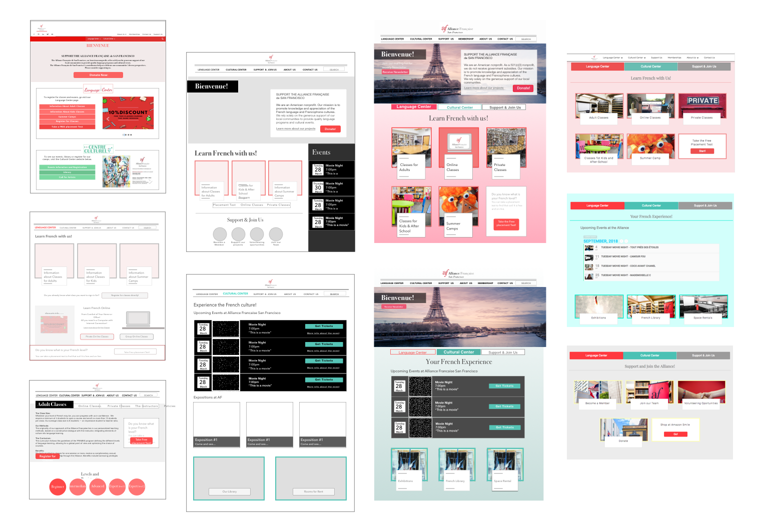
Information Architecture - Improve Navigation

- Map the relationship of all the screens in the website

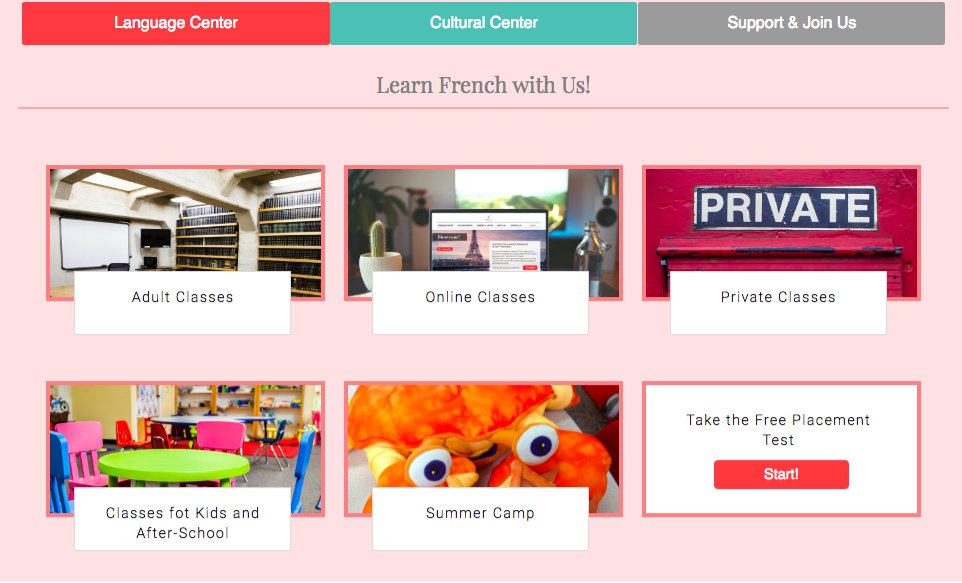
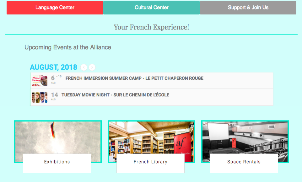
- Create more direct and logic paths. By separating the content into three main areas:

Language Center

Cultural Center

Donation and Support Us

Plus the About and Contact pages


Divide the home page into a welcome message with the info that the organization wishes to share at the moment. And three sections with links to the three main areas mentioned before.

Aesthetics

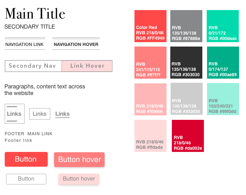
- Create a stylesheet to bring consistency

- Use the brand color only for the logo

- Use the brand font only for main titles and apply a secondary font for all the remaining text

- Make the color association, created by the client, more obvious and easier to understand by the user. Where reds are related to Language Center, and greens are associated to Cultural Center

Design Process

Development Challenges

- The WordPress template was not being used as it meant to. It has been overwritten many times. Many of the plugins used allowed for little styling

- At that time, the board did not yet allowed the migration to a better platform for classes enrollment (*They did after this project was done, August 2018)


Development Approach

Modify the website inserting plain HTML, CSS and JavaScript to adopt the new design and fix issues on the mobile version

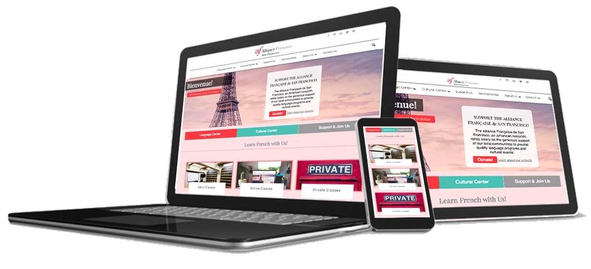
Responsive Design

This website was designed and developed using flexible layouts, it responds to the user's behavior based on screen size, platform and orientation